Project brief
Dlabs.hu is a Hungarian crypto company building Mosaic Chain, a blockchain platform, and Mosaic Alpha, an investing app built on top of it. An agency designed the product and handed Dlabs a single Figma file with everything in it: colors, type, components, and finished screens. Developers were building from that file, and there was no designer on the team.
Dlabs asked me to look at what they had and tell them 2 things. Was it a real design system? And if not, what would it take to get there?
- Timeline2Weeks
- Effort14Hours
- Components audited29
Defining the ask
A design system audit, not a UX audit
When I wrote the proposal, I wanted to be clear about what kind of audit this was. A UX audit looks at the experience of a working product. A design system audit looks at the tools behind that experience, like the components, tokens, guidelines, and workflow that designers and developers use every day. Dlabs needed a design system audit. I spelled that out in the proposal so they could correct me before I spent any of their hours on the wrong thing.
I scoped the work to 5 areas:
- Component library: completeness, consistency, and usability of the UI components.
- Design tokens: how color, type, spacing, and elevation were defined and applied.
- Accessibility: compliance with WCAG 2.1.
- Documentation: whether a designer or developer could use the system without having to ask someone.
- Workflow integration: how the system moved from Figma into code.
How I approached it
Measuring against a standard
I compared the Mosaic Chain file to the structure most mature design systems share. That meant design language (vision, principles, voice and tone, terminology, accessibility, and internationalization), foundations (color, layout, typography, elevation, motion, and iconography), and 29 core components. For every finding, I made sure I could point to something specific in the file, whether it was a layer, a value, or a screen.
I also wanted Dlabs to know this wasn’t a report card on the agency’s design work. I was looking at the system behind the design, and my goal was to give them a clear picture of where they stood and how to move forward.
What I found
The beginnings of a system that nobody was using
There was a lot to build on. Colors were saved as Figma variables, named in plain words like “blue,” scaled in numbered steps, and had a dark mode. Layout was on a 4px grid with desktop, tablet, and mobile grids already defined. Type styles and an icon set were in place.
But when I checked whether any of it was actually being used in the components and screens, the cracks started to show.
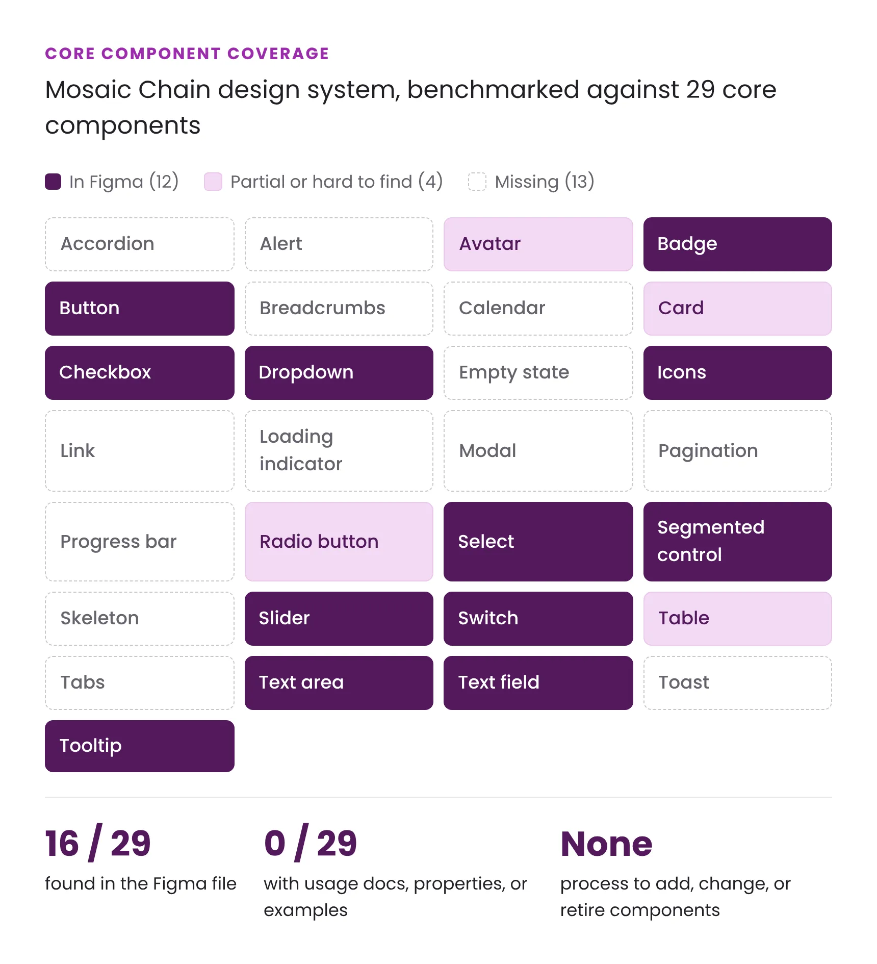
16 of the 29 core components existed in Figma. None of them had an overview, usage guidance, properties, or examples, and there was no process for adding, changing, or retiring a component.
Values were typed in by hand
Spacing and corner radius variables existed, but many components used hand-typed numbers instead. I found 2 controls that look like they belong to the same family with different corner radii. On their own, these are small inconsistencies. But when a value needs to change, someone has to go hunt down every place it was typed in by hand.
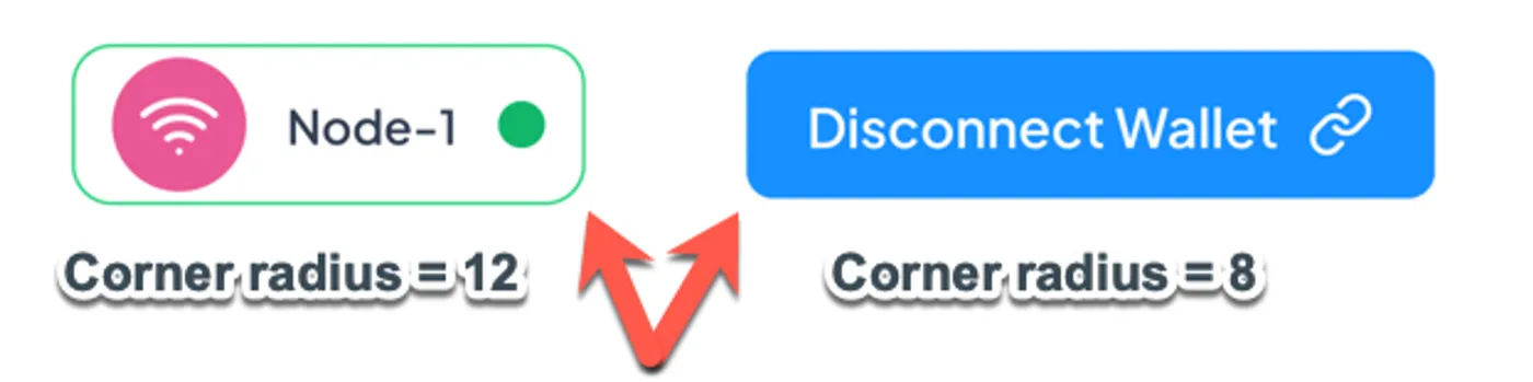
2 controls that look like the same family, with 12px and 8px corners.
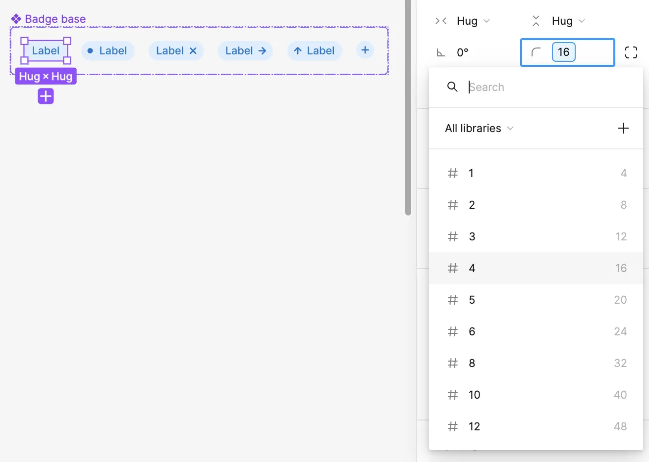
The fix is to apply the saved variable, so 1 change updates every instance.
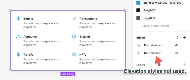
Elevation had the same problem. Shadow styles were defined in the file, but I couldn’t find a single component that used them. Every shadow had been added by hand.
Accessibility gaps in the components
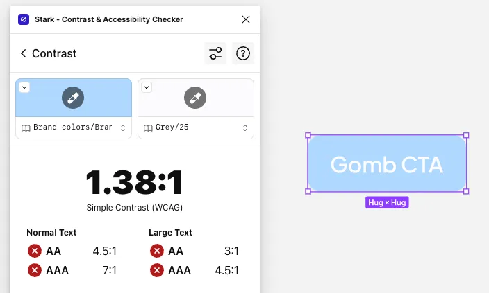
Color contrast in the palette was mostly in good shape, but some component variants failed. The disabled button came in at 1.38:1, well under the WCAG AA minimum of 4.5:1. Some badge and text avatar variants failed too.
I also found a Terms of Service checkbox drawn as a circle. To most people, a circle means a radio button.

No design language to guide decisions
There were no design principles, no voice and tone guidelines, and no accessibility or internationalization standards. This mattered more than usual because the product was meant for very different groups of people: “grandmas and grandpas,” “crypto bros,” and professionals. A terminology guide would go a long way here. Dlabs already kept a crypto dictionary on their website, so I recommended bringing it into the design system instead of starting from scratch.
Recommendations
A plan in 3 phases
I opened the report with Gall’s Law: “A complex system that works is invariably found to have evolved from a simple system that worked.” I took that to heart when I laid out the plan. Rather than try to build everything at once, I broke the work into 3 phases, with each phase setting up the next.
First: get the foundations in order
Goal: anything built from here on is built on solid ground.
- A Figma license of their own. I recommended Dlabs get its own Figma license so their design files weren’t living with the agency.
- Separate libraries. I recommended moving foundations (color, type, spacing, and elevation) into 1 shared library and components into another.
- Connected values. I recommended replacing hand-typed corner radius, spacing, and shadows with the saved variables, so 1 change updates every component that uses it.
- Base colors split from colors named by their use. I recommended that components use names like Warning or Surface instead of raw values like Blue 500.
- Accessibility fixes. I flagged the disabled button, badges, and text avatars that failed WCAG AA contrast to be fixed first.
- A designer on the team. I recommended starting the hiring process right away. Until then, developers would keep making design decisions while they built.
Next: fill in the gaps
Goal: the library matches what the product actually uses.
- Missing components the screens already use. Breadcrumbs, the date picker, pagination, and full data tables were all in the designs with no component behind them, so they were being rebuilt by hand every time. I put these at the front of the line.
- Documentation for the 16 that exist. Each one needed an overview, guidance on when to use it, its states and properties, and examples.
- Naming conventions, so a developer could find “Select” without having to know the agency called it “Input Dropdown.”
- A process for changes, covering how a component gets proposed, updated, or retired. I’ve set up a process like this before, and you can see the flow I used in my UX Grab Bag case study.
- The basic design language, starting with design principles, voice and tone, and a terminology guide built on Dlabs’ crypto dictionary.
Later: scale it
Goal: the system holds up as the product grows.
- Storybook, so components are built, tested, and documented in code as well as in Figma.
- Shareable design tokens using Tokens Studio, once the foundations are stable.
- Audits of the live components using a checklist I wrote for the team. It covers visual alignment, states, keyboard and screen reader support, performance, and code quality.
- Everything else, including motion, screen-size breakpoints, internationalization, and the rest of the missing components.
Outcomes
I delivered the full audit report and a summary deck in June 2024, and Dlabs accepted the proposal. Shortly after, the crypto market took a hit and Dlabs scaled back its operations, so the recommendations were never put into practice.
Even so, I’m proud of how this audit came together. I set a clear scope, measured the system against a known standard, and backed up every finding with an example from the file. Dlabs walked away with a plan their team could act on without needing a designer to translate it for them.
If I’d stayed on
Here’s how I would have helped turn the plan into a working system:
- Pair design with engineering. I’d hold a standing weekly session with the lead developer so every component gets designed and built together. A component wouldn’t be finished until it’s in both Figma and code. Learning to speak the engineers’ language is a big part of my UX Grab Bag story.
- Review new screens against the library. I’d run a short design review on new screens and ask which components each screen is built from. Anything that doesn’t fit becomes a new component or a documented exception. It’s similar to the bi-weekly design reviews I planned for the pattern library in my Skipio UX Strategy.
- Set up the new designer for success. The First phase is what makes this hire work. Whoever comes in would inherit organized libraries and clear rules instead of 1 overgrown Figma file.
- Test the terminology with real users. I’d run the terminology guide past all 3 audiences the audit named: grandmas and grandpas, crypto bros, and professionals. A word like “stablecoin” means very different things to each of them.
- Track a few numbers to show progress. I’d keep an eye on the share of screens built from library components, the number of hand-typed values left in the file, and the number of contrast failures (with a target of 0).