Project brief
At Lucid, our VP of Design assigned me to the platform team to help solve problems the whole org was running into.
We had several product teams building at once, each shipping fast and mostly on its own. Every team kept running into the same problems: how to bring external data in, how to keep it fresh, and how to turn it into reusable pieces. Because each team solved those problems on its own, we were building several versions of the same thing with nothing shared underneath. I described it to leadership as three front doors to the same house. Every door works, but as soon as a user needs to move between them, the differences get confusing. A platform team owns that shared layer so every product gets one consistent set of patterns instead of reinventing them.
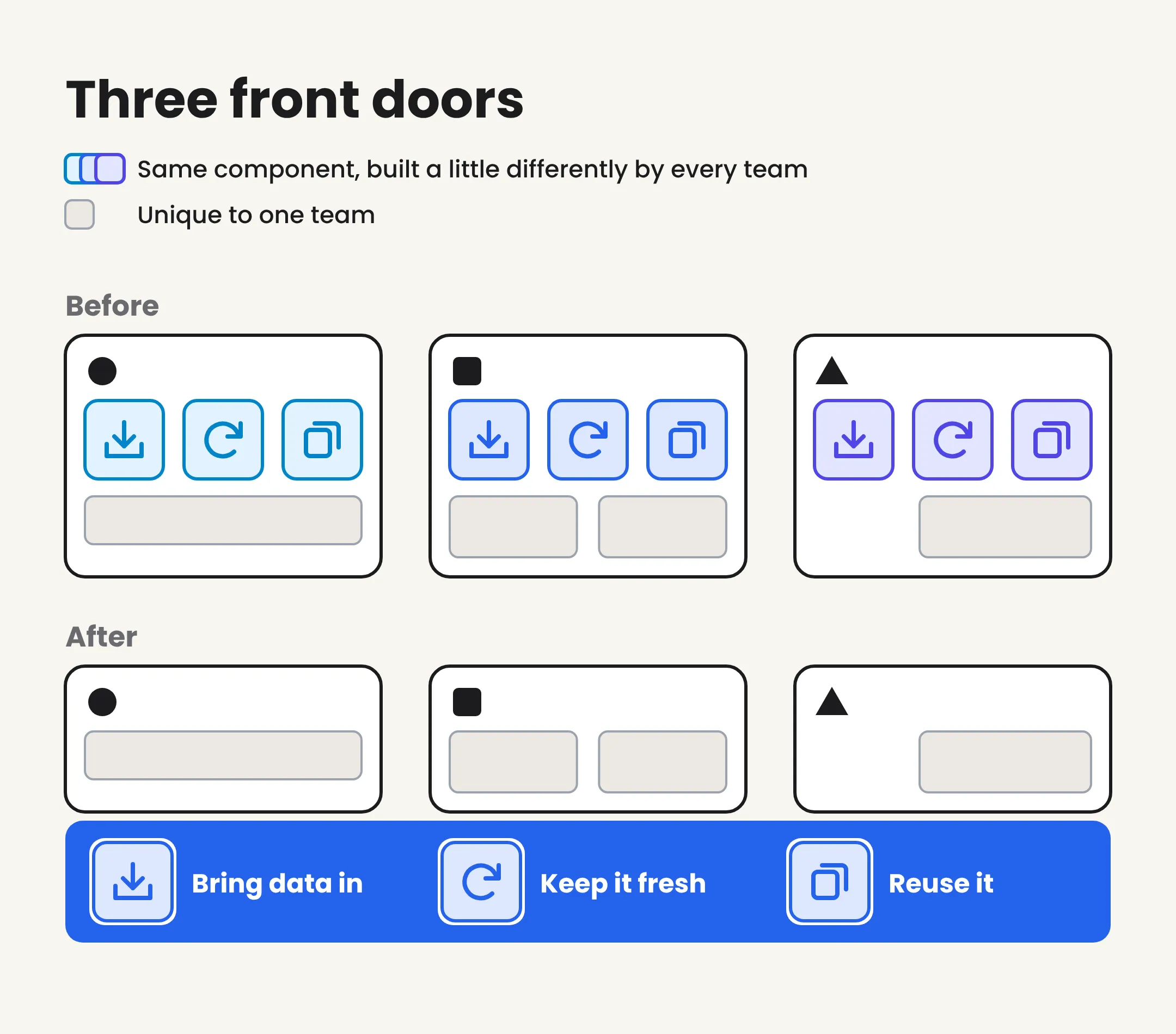
Three teams solving the same problems with no shared foundation, versus one platform layer they all build on.
One product team had designed a feature that let users pull external data into an existing document and keep it in sync. They’d built it out in design and it worked well for them. I was asked a harder question: should this become a platform pattern that every product team uses, and if so, which parts are actually platform and which parts are just this one team’s version of it? This sync feature could go either way. It could become a shared pattern, or it could become one more thing each team builds differently.
This comes up a lot in platform work. A team solves their own problem well, and everyone assumes their solution should be the standard. But a solution built for one data model, one set of labels, and one set of capabilities isn’t a platform pattern. It’s a snapshot. My job was to sort out which parts were the pattern and which parts were the snapshot, before anyone spent a quarter building the wrong thing.
What I wanted to avoid was copying the team’s design as-is and calling it “the platform component.” That would bake their assumptions into everyone else’s product.
How I framed it
I didn’t want to just review screens. I wanted to figure out why each screen existed. Every screen in that file was a response to something a user needed at that point in the flow. If I could name the need behind each screen, I could separate the need (probably universal) from the team’s answer to it (probably not).
So I asked the same question about every screen, state, and open decision: what does the platform own, and what does each team own on top of it?
Step 1: audit the design
I went through the design file screen by screen and built a table. Each screen got a row, and the columns forced the question: what the user needs here, what this design does about it, what’s specific to this one team, and what the underlying platform pattern is. Then I color-coded every row into three tiers.
- Platform-ready. The pattern is already generic. Use it as-is.
- Universal need, too-specific solution. Every team hits this moment, but the design baked in one team’s assumptions. Generalize it.
- Team-specific. Tied to a capability or data model only this team has. It can’t move to the platform without a different trigger.
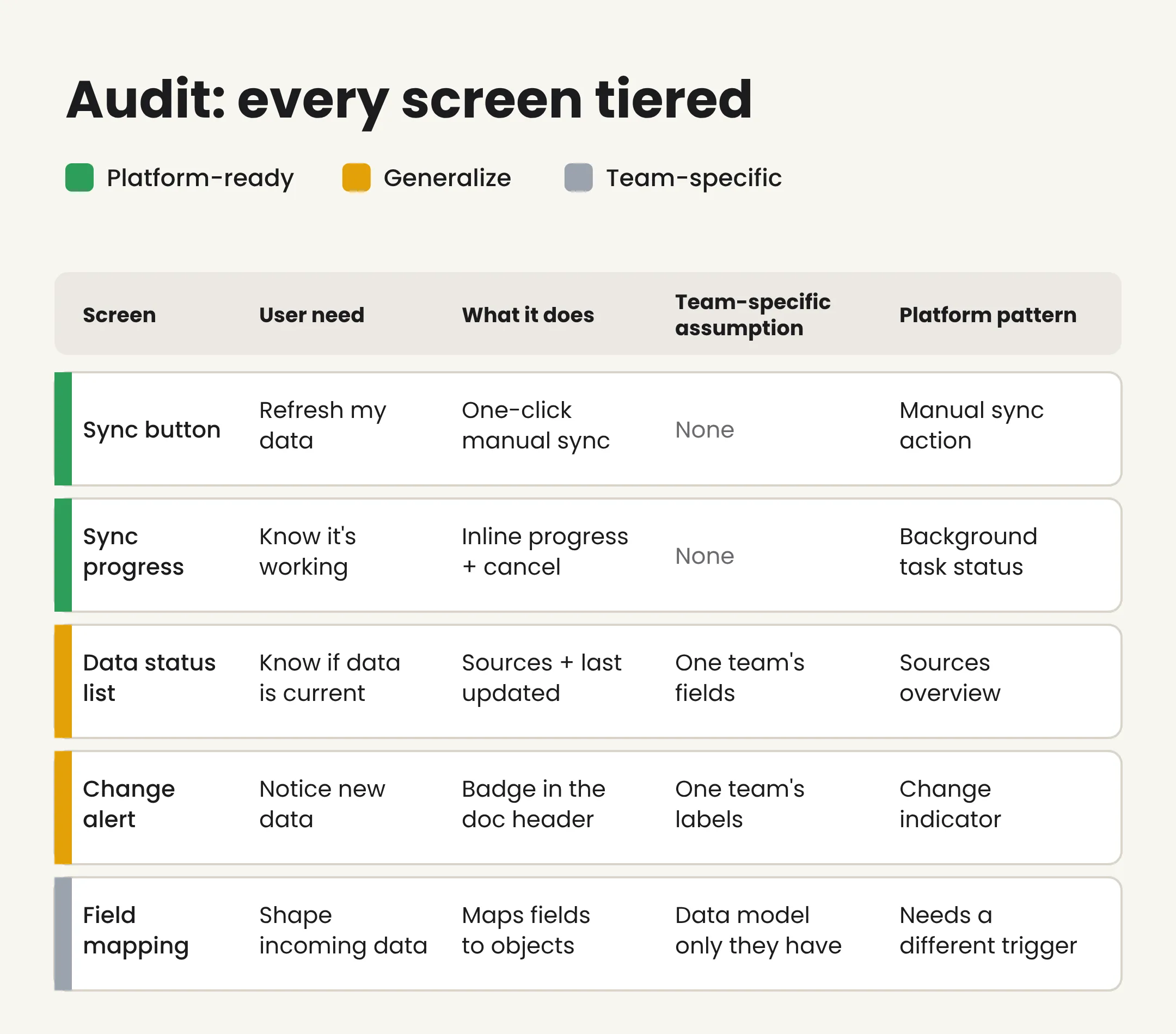
Every screen sorted by how reusable it was. Recreated with example rows.
The tiers did most of the heavy lifting. Instead of a vague “how much of this is reusable?”, I had a call for each screen that I could walk engineering through row by row.
Two things came out of the audit that shaped everything after.
First, when I stopped organizing by screen and started organizing by what the user was trying to do, the flow came down to six moments that show up in any sync experience, no matter the product:
- Discovery. What data is available to me?
- Awareness. I know what I have, so what do I need to know or do?
- Configuration. I need to control something.
- Decision. Commit or walk away.
- Handoff. I’ve committed, the system is working.
- Resolution. Did it work?

Six moments that show up in any sync, and where control passes from the user to the system.
Those six moments became the backbone of the whole model. None of them depend on a specific product, which is what makes them work at the platform level.
Second, I logged every open question as I went instead of stopping to solve it. In the middle of an audit, stopping to answer a question breaks your momentum and pushes you toward the first answer you think of. So I wrote down the question, my early thinking, and who needed to weigh in. When the table was done, I worked through the questions together. The ones I could answer became decisions. The ones I couldn’t became the agenda for the next step.
Step 2: define the platform model
This was the hardest part and the one that mattered most. For each of the six moments, I worked through three questions.
What are all the universal states? Not just “syncing,” but every real condition the user and system can be in. One moment alone had eight: resting, never synced, new data available, settings changed, a combined state, sync failed, automatic sync active, and a sync someone else started. Engineering has to build every one of these, so if a state isn’t named, it doesn’t get built.
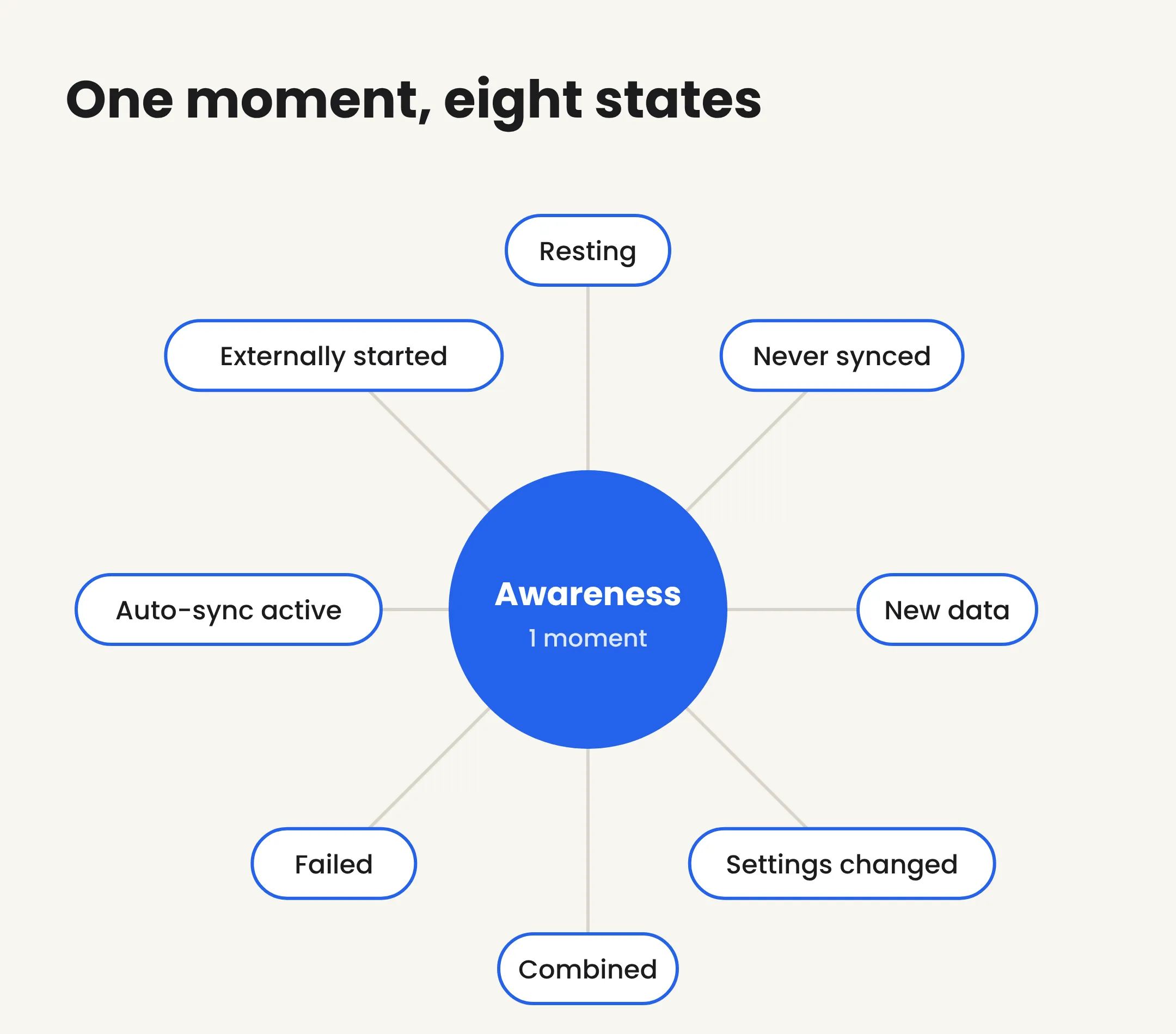
One moment, eight states.
Where are the decision points? Every place the user has to make a choice, no matter the product. Some were obvious, like whether to sync or walk away. Others were buried, like what happens when someone changes their settings while automatic sync is running.
What changes from product to product? Labels, data types, and which capabilities exist. I built those differences into the model as settings each team fills in, instead of something each team hacks in later. If you don’t plan for those differences up front, they get hardcoded, and the pattern breaks the first time a second team tries to use it.
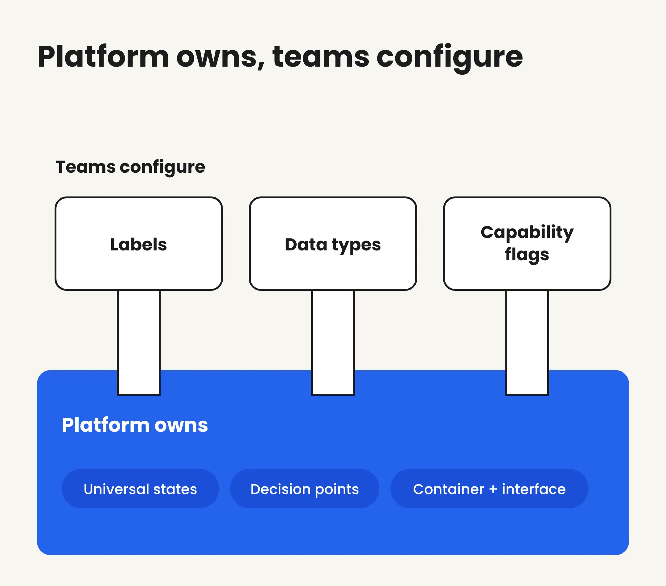
The platform owns the structure. Teams fill in the details.
The result was a written platform spec covering the six moments, every state, every decision point, and what each team configures. I wrote it as a document instead of a design file so teams could agree on it before anyone started designing screens. I also drew the six moments as a flow diagram showing where the user is in control and where the system takes over, so a stakeholder could see the whole thing at a glance.
Seeing red dots everywhere
When source data changes, how do you let the user know? The first instinct in the room was a red badge. I pushed back. In most design systems, red means something is wrong, and “new data is available” isn’t an error. So the platform signal became a neutral indicator on the panel that holds the data. It’s not red, and it’s not in the document header, where people would mistake it for a change to the document itself.
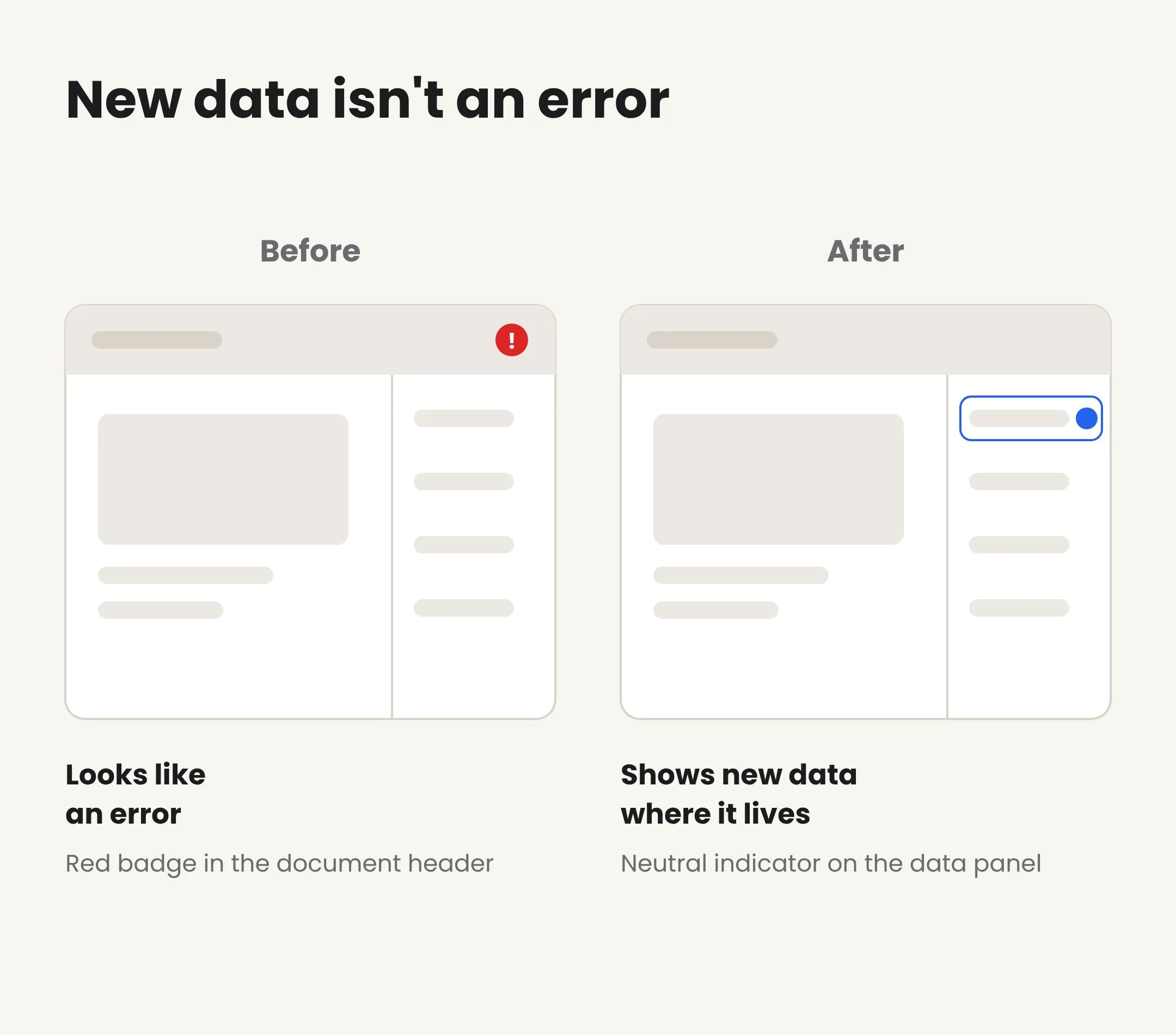
Showing that something changed, without making it look like something broke.
It’s a small decision, but it’s the same question at work. The platform owns the signal (something changed). How loud that signal should be, and where it lives, has to fit what actually happened.
What the work produced
I didn’t hand off screens. I handed off the audit table, the six-moment model, the platform spec, and the flow diagram, all answering the same question: what belongs to the platform, and what belongs to each team? It was documented well enough that any team picking up the pattern would also get the reasoning behind it.
That’s what makes platform work worth it. The hard thinking happens once, and every team that builds this experience afterward starts from the same pattern instead of starting from scratch.
The method works for any “should this be a platform pattern?” question. Audit the existing design, name the need behind each screen, sort every screen by how reusable it is, find the moments that apply to any product, then map out the states and what each team configures.
What I learned
- Start with the why, not the UI. Once I knew the need behind each screen, it was much easier to tell what was reusable and what wasn’t.
- Sort everything into tiers. Platform-ready, generalize, or team-specific. Putting every screen in one of those buckets turned “how reusable is this?” into a call I could make and explain, one screen at a time.
- Organize by what the user is trying to do, not by screen. The six moments only showed up after I stopped looking at screens.
- Write down open questions instead of solving them on the spot. Working through them after the audit kept me moving and kept me from locking in the first answer I thought of.
- Plan for what will be different. Anything I didn’t plan for would have been hardcoded, and it would have broken the first time a second team tried to use the pattern.